0

I have a section on my website, where I load data from backend. And i want the data to be rendered as the following preferred as an grid format.

The height of each row item depend on the data, that is beeing loaded. Desired form: desired form
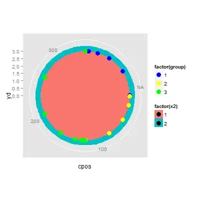
I first was trying to achive it with a grid-display, but that doesn't work. For static websites there are possibilities to get the desired result (hardcoded), but for dynamic websites not. So i've got following result with grid:

output with grid-display

So probably the best way, i thought would be to use 2 divs, that represent the cols. However this should be responsive for mobiles etc. so it should convert to only one col on mobile. And there comes the problem with using divs instead of grid: It doesn't have the same order anymore:

flex don't have the same order

I was testing every grid-settings that are described in the documentation. But i could not figure it out how to do it. I have the assumption, that this won't be possible with grid.

(If that isn't possible, i will use completely different code for mobile and desktop with media querys. But my intention was to keep the code simple as possible.)

Is it possbile, to do that with a grid?
  • Hello, I'm afraid that won't be possible automatically with grid. You can try grid auto flow column, span the end... whatever, grid remains a grid with "straight lines". Question: how many items will you put in each column? In fact do you know the total number of items, you're receiving from backend? – pier farrugia Feb 08 '23 at 17:34
  • @pierfarrugia thought the same about grids... I will have 2 cols on desktop and 1 on mobile. And undefined number of rows. My backend is connected with an third-party cms (hygraph). So the number could be up to infinite – TrueStoryShort Feb 08 '23 at 17:42
  • 1
    so the only way is to have your 2 cols grid, put item even (0, 2, 4) col1 (make a modulo operation to know where you are), item odd in col2. Problem now is what about mobile!!! You'll have to recompute everything in 1 col! Perhaps 1 big trick would be to put a 1 col grid absolute position at left:-10000px, you put all your items in. Now you "render" them in 2 cols grid in case desktop (even,odd), and you render them in 1 col grid in case of mobile. – pier farrugia Feb 08 '23 at 18:26

0 Answers0