So I'm using Twitter APIs to gather info related to a certain topic, and one of the things I'm visualizing is the popularity of devices.
So far I have this: https://gyazo.com/441a9ab80b943f9e0c3a36131273844a
The above is generated by this code:
device_types_condensed <- (ggplot(manu_tweets3, aes(x= statusSource_clean , fill = isRetweet)) + geom_bar()
                 + theme(panel.background=element_rect(fill='white'),
                         axis.ticks.x=element_blank(),
                         axis.text.x=element_blank())
                         + theme(axis.ticks.x=element_blank(), axis.text.x = element_text(angle = 25),
                         axis.text=element_text(size=8))
                         + labs(x="", title = "Device Popularity for Tweet or Retweet Usage", y ="No. of Tweets on Device")
                         )
device_types_condensed
What I want to do is to add text above each bar that reflects the % of tweet activity that device is responsible for.
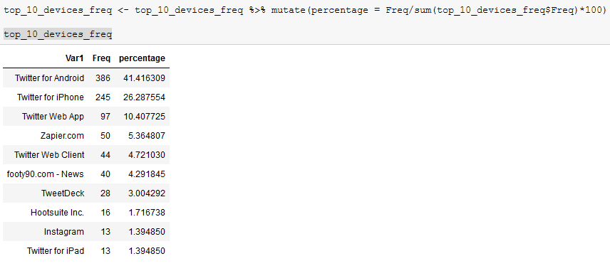
This means I am not changing the y-axis. The y-axis still reflects the count of tweet, and the number on top of the bar will be what reflects the percentage. So far I already have a table made with that value: https://i.gyazo.com/5f14d2c1352e8c9c2c5997678ceea3b4.png
What I can't figure out for the life of me is how to select the % labels in the table just above, and then apply them to the ggplot graph based on device type.
Sorry, don't have the rep to post images but I linked the URLs!
