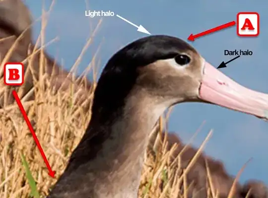
This halo is typical of sharpening methods that usually:
- make a slightly blurred version of the image (so an image without the high frequencies)
- subtract some of this from the original image (and so increase the high frequencies, and makes the image appear sharper)
Lifted from an old Gimp documentation:
Using an unsharp mask to sharpen an image can seem rather weird. Here is the explanation:
Think of an image with a contrast in some place. The intensity curve of the pixels on a line going through this contrast will show an abrupt increase of intensity: like a stair if contrast is perfectly sharp, like an S if there is some blur.

Now, we have an image with some blur we want to sharpen (black curve). We apply some more blur: the intensity variation will be more gradual (green curve).
Let us subtract the blurredness intensity from the intensity of the image. We get the red curve, which is more abrupt : contrast and sharpness are increased. QED.

What the Gimp doc doesn't tell but is visible in the picture above is that the red line "overshoots". In other words, near the place where the transition happens, there is are small areas where things are darker/lighter than they should be. If the transition is along a line (marked edge of an object), these areas from a halo (usually the light halo is much more visible than the dark one).
Unsharp mask has first been used in silver photography. The photograph first creates a copy of the original negative by contact, on a film, placing a thin glass plate between both; that will produce a blurred copy because of light diffusion. Then he places both films, exactly corresponding, in a photo enlarger, to reproduce them on paper. The dark areas of the positive blurred film, opposed to the clear areas of the original negative will prevent light to go through and so will be subtracted from the light going through the original film.


