Let us see what the axes of the histogram represent.
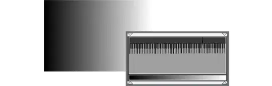
I started with a simple gradient which has overall the same amount of pixels of each luminosity or brightness intensity.
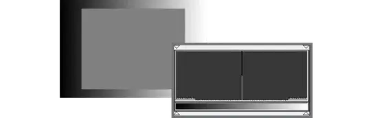
Then I am adding a single zone of one gray, therefore more pixels of that particular gray are present on the image.

The gradient is the same, but as I add more gray pixels the gradient zone is smaller and smaller.
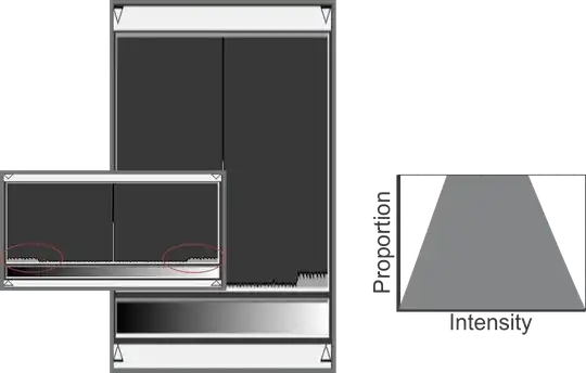
Now is obvious that the elements of the histogram are intensity (brightness or luminosity) vs amount of pixels. And this Y axis is just proportional.

The cropping of the top is for a practical reason. We normally want the histogram to tell us about some details we can not see in... well, detail.
If we wanted to know how are our bright and dark zones (red) we would need to zoom in on the vertical axis, this means you need to cap and truncate the upper zone of the graph, which is not important because this does not represent a clipping on the histogram.
We, of course, could have some logarithmic scaling, but this needs more processing power, which can not be implemented on a small camera, and it is not implemented in some applications (shame on you Ps and Lr)
But some applications, mainly video color grading ones, have a logarithmic scale called waveform.
These scales allow you to see what is happening in those areas but let you see the overall picture without the need of clipping the graph.
Some other graphs are good for other kinds of color analysis, for example, a vectorscope (Shame on you Ps and Lr)
So different graph implementations are good for some adjustments and analysis and other are good to other stuff.
A simple histogram is just a simple tool.


