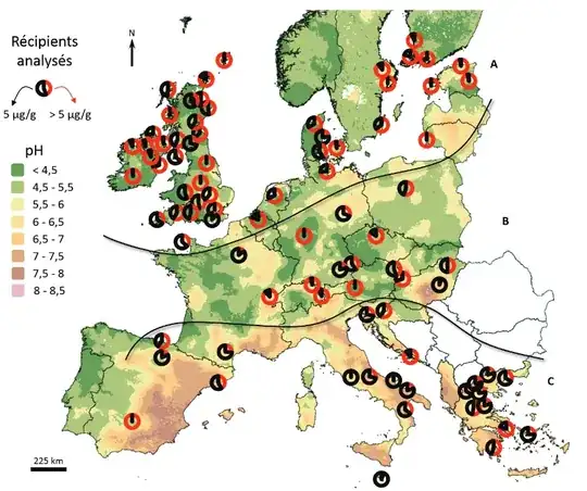
Does anyone know how to create a map such as this one in QGIS? In short, if we have a table with list of sites with coordinates and and one column with numbers dedicated to μg /g according to which our pie chart is created as depicted on the picture?
Asked
Active
Viewed 798 times
2
-
Did you read the QGIS documentation (https://docs.qgis.org/3.22/en/docs/user_manual/working_with_vector/vector_properties.html?highlight=pie#diagrams-properties) ? if yes what didn't work ? – J.R Aug 24 '22 at 13:46
-
1I understand that you want a piechart as a symbol... but I don't understand the map honestly. The legend is unclear... "récipients analysés" has nothing to do with + or - a quantity? Plus what means black and what is red? A piechart is normally in %? – katagena Aug 24 '22 at 15:00
-
@katagena Yes, the legend is % of "something" that has more or less than 5g at a ceratian location. How do I get to a symbol of this type as a pie chart? – Zea Aug 24 '22 at 17:54
-
If you need a specific symbol as pie chart you may try your hand at dynamic SVG creation. See these for some pointer : https://gis.stackexchange.com/questions/380964/qgis-labels-with-html-formating, https://gis.stackexchange.com/questions/379437/use-text-diagram-for-labeling-in-qgis/379578#379578 – J.R Aug 25 '22 at 09:18
-
1Or you may try the geometry generator way : https://gis.stackexchange.com/questions/367481/grayscale-pie-chart-in-qgis/367487#367487 – J.R Aug 25 '22 at 10:18
-
Will try this out, thank you! – Zea Aug 25 '22 at 11:37
1 Answers
-3
Check here. You’ll found what you need, I think! [EDIT]: OK, I have a lot of minus... not sure why, so if someone could explain, it would be nice?!?
katagena
- 1,659
- 1
- 6
- 15
-
It was already mentioned in comments above... also I do not think it explains how to transform the usual pie-chart into the symbol seen above or am I missing something... – Zea Aug 25 '22 at 07:49
