7

I've heard that our eyes accommodate between colors too far from each other in the visible spectrum. I imagine it's not a true focal point accommodation, but rather linked with how brain processes the information. Is this true?

What I'm trying to find out is, whether using color for emphasis, for example both blue and yellow (which are fairly far from each other in the spectrum), for text underlining, doesn't make the brain focus only at one color at once.

Like when you're looking for some object on your messy table, thinking it's of blue color and not noticing it's right in front of your eyes, because it was red.

Another example would be a document with some emphasized words in blue, some in yellow - and let's say the author wanted to make sure both colors are regarded as important (just in different context). Now question is, can the eye/brain focus on both colors at once? I don't mean if we can do it deliberately by trying hard, but rather if it's more likely for the brain to focus only at one color at a time, unconsciously.

By what I've heard, if I understand it correctly. If we want to use two different colors for emphasis, we should use colors that are close to each other in the EM spectrum (while still making sure, they are high contrast in regard to the background)

Refer to the two paragraphs taken from wikipedia I stylized.

I'd summarize the question like this. Is there difference in how we regard those two paragraphs? Are we more likely to skip some words when they are highlighted with colors too far away from each other in the EM spectrum, therefore, is it better to use colors closer to each other?

EDIT: I changed the luminance of the colors to be the same for all of them (70%, used HSL Color Picker). As pointed by John, the different luminance might have played a part in the perception.

enter image description here

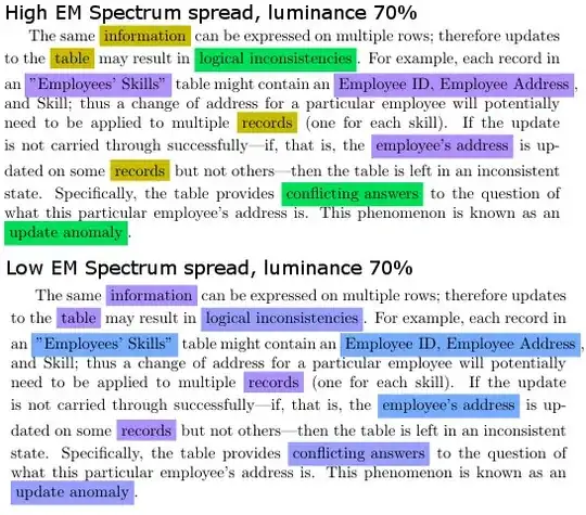
View of the relative EM wavelength spread (images taken from Gimp) enter image description here

dwelle
  • 305
  • 1
  • 6
  • When you say "our eyes accommodate between colors" do you in fact mean "our eyes discriminate between colors"? In other words, do we focus on one colour at the expense of another, very different color? – Matt Obee May 31 '13 at 11:49
  • Not sure whether discrimination is the right word - but your second question seems quite accurate. See edit. –  May 31 '13 at 12:03
  • I don't think this should have been migrated. Even though it is a cognitive science, it definitely is a UX issue. – dwelle May 31 '13 at 13:01
  • The underlying question is probably more suited to cogsci and likely to receive more informed answers here, which is not to say that those answers won't have UX implications. – Matt Obee May 31 '13 at 13:14
  • Still, saying that color theory/design is better suited for cognitive sciences implies that half the UX questions should be moved here as well, when you think about it. This was asked from a UX viewpoint, so it should reside there. – dwelle May 31 '13 at 13:17
  • I would think where it comes to highlighting text, a major issue that's being ignored in your example is contrast. Part of the reason the top example looks so much different than the lower example is that the contrasting is a bit reversed. The yellow and green in the top are in high contrast from the text and the purple is a low contrast from the text. In the example below, the higher contrast is the light blue and the lower contrast are the more purple colors. – Pete May 31 '13 at 19:12
  • Were you thinking of something like color afterimages? http://en.wikipedia.org/wiki/Opponent_process – crsh Jun 18 '13 at 11:09

1 Answers1

3

I don't think it is a matter of color/hue. Do you have a source for this hypothesis? If you were able to measure this effect then I would think it happens because of the importance rating a reader develops for a certain group of highlighted words, e.g. "all blue highlighted words are important to me."

The user Pete made a good comment in my opinion by pointing out the contrast issue. The attention of humans is foremost guided by luminance contrast. Then comes hue and then saturation. The colors you chose have a different luminance value and therefore attract attention differently.

Here's a link to compare the (relative) luminance values of your color sets.

John
  • 146
  • 2